 Don’t be afraid! The yellow brick road to the Emerald City of reporting isn’t as scary as it seems! If you’ve been reading our blogs, you already know how to gather a funnel cloud full of data and have landed it in Oz by learning how important it is to turn it into useful information. Now all we have to do is figure out the best reporting options for your company and the good news is you won’t need a wizard to do it.
Let’s use Microsoft Excel as an example. Our business solutions consultants at Softech Solutions LLC have found that most of our clients are already very comfortable with this program and are more open to using it as an conduit for delivering their data results. The awesome part is there are so many ways to view the results including line, pie, vertical, bar and data tables that are easily customizable depending on what you want to see. Take a look at some of the options: [lets’s use the tables and charts from the email newsletters]
 The line charts and data tables are dynamic indicating that as the line chart increases, the data table above shows the sales rep how close they are to goal!
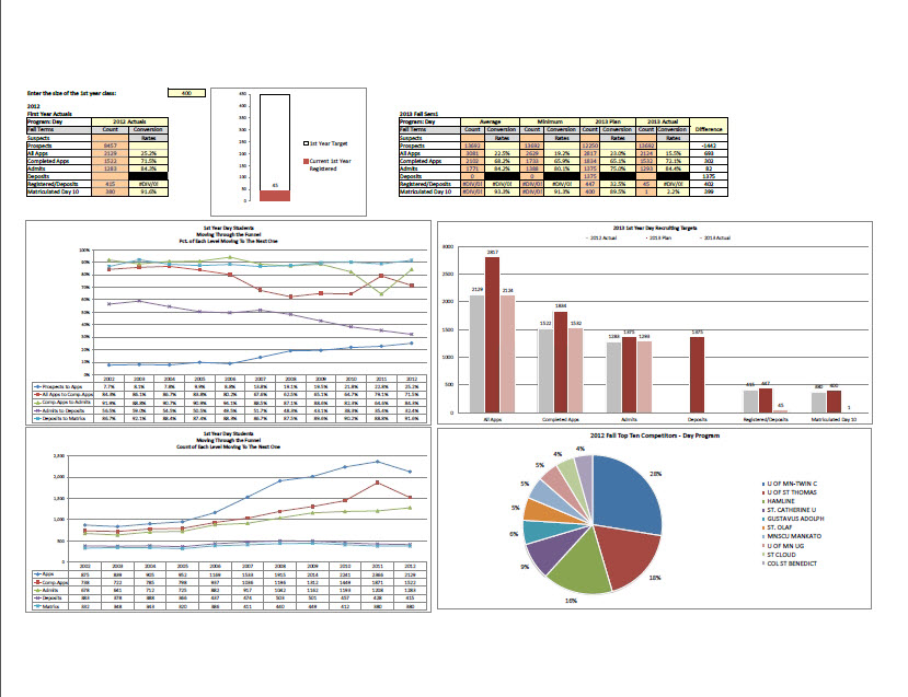
The pie chart is a slice break down of territory for the sales reps. This shows the sales rep where the most sales are coming from and where to focus future sales energy.
The bar chart is comparing historical data – last year, current year and goal grouped by product.
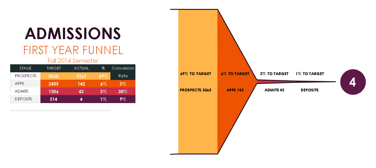 The image below shows a conversion funnel showing number of customers in each sales stage with its data table to the left.
Our data analysis pros can create just about any report you want to see, which means if you really want to make use of those ruby slippers, you should contact us now. The Emerald City of reporting is just around the corner waiting for you to walk through it’s doors and discover how to turn your data into GOLD.